iPro / Type
Websites have common typographic needs: clear and consistent headings, highly legible body paragraphs, clear labels, and easy-to-use input fields. We recommend a font that uses a open-source family: Open Sans is designed for legibility and can beautifully adapt to a variety of visual styles.
Pairing Fonts
's font pairings are meant to set each other off, not fight the eye for attention but rather harmonise without becoming homogenous and dull. The age-old rule goes as follows: concord or contrast, but don't conflict.
Open Sans
Open Sans was designed with an upright stress, open forms and a neutral, yet friendly appearance. It was optimized for print, web, and mobile interfaces, and has excellent legibility characteristics in its letterforms. Open Sans is an open-source sans serif typeface created for legibility in UI design. With a variety of weights that read easily at all sizes, Open Sans provides clear headers as well as highly-readable body text.
Aa
A B C D E F G H I J K L M N O P Q R S T U V W X Y Z
a b c d e f g h i j k l m n o p q r s t u v w x y z
0 1 2 3 4 5 6 7 8 9
Font Variations
Open Sans Regular
Open Sans Regular Italic
Open Sans Bold 600
Open Sans Bold 600 Italic
Open Sans Bold 900
Where To Use
ultilizes Open Sans as a base font for all non-header text. Non-header text is catagorized as: paragraphs, links, page descriptions, notes, buttons, and tables.
Usage Guidelines
| # | Usage | Font Size | Color |
|---|---|---|---|
| 1 | Page Header H1 | 36px | #333 |
| 2 | Subheaders H3 | 24px | #0074c8 |
| 3 | Paragraph Text | 14px | #5a6771 |
| 4 | Labels | 14px | #555 |
| 5 | Text Link | 14px | #0074c8 |
| 6 | Small Text | 8px | #5a6771 |
Typesetting
Typesetting involves arranging letters and symbols according to the rules of the language being used, including spelling, hyphenation, capitalization, word breaks, emphasis, and punctuation. When typesetting, a pre-designed font is used and generally various fonts from the same typeface (font family) are used to differentiate between headlines, sub-headings and paragraphs.
Typesetting Rules
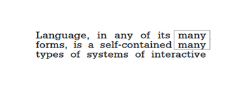
- Never stack words View Example
- Never stack hyphens View Example
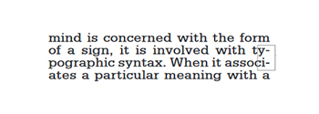
- No rivers or loose lines View Example
- Use a minimum of 3 lines in a paragraph at the end and beginning of columns
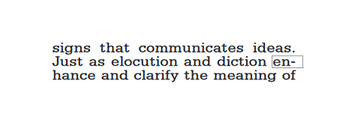
- Never have 2-letter hyphens at the end of a line View Example
- No widows or orphans on a line ending a paragraph View Example
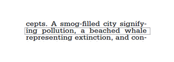
- Always have a good undulating rag for copy settings View Example
- Always make sure your punctuation marks are the correct format
- Never less than 5 words per line, Never more than 15 words per line View Example
- A word following a period at the end of a line must be at least 3 characters or more View Example
Links
Links lead users to a different page or further information.
- Users should be able to tab to navigate between links.
- Users should be able to activate a link when pressing ‘Enter’ on their keyboard.
- Users should be able to identify links without relying on color alone.
- Users should be able to activate hover and focus states with both a mouse and a keyboard.
| Active | Visited | External Page | Dark Background |
|---|---|---|---|
| This is a text link on a light background. | This is a visited link. | This is a link that goes to an external website |
This is a text link on a dark background. |
Lists
Lists organize written information for users. Lists are styled by default.
When to use
- Use an ordered list when you need to display text in some ranking, hierarchy, or series of steps.
- Ordered list item.
- Ordered list item.
- Ordered list item.
- Ordered list item.
- Use unordered lists to display text in no specific order.
- Unordered list item.
- Unordered list item.
- Unordered list item.
- Unordered list item.
When to consider something different
If you need to communicate long lists of narrative text.
Guidelines
Use sentence case and begin lists with a capital letter. Use punctuation appropriate to the text. Do not leave sentences without periods.
Headings
Alignment: Type set flush left provides the eye a constant starting point for each line, making text easier to read.
Line length: Controlling the length of lines of text in extended copy makes reading more comfortable by helping readers’ eyes flow easily from one line to the next. Somewhere between 50 and 75 characters per line is broadly considered to be a readable line length, while 66 characters is considered the ideal. Other factors beyond line length also affect reading comfort. Text with more space between lines can have somewhat longer line length. Also, contexts in which users will not be reading long passages of text (such as footnotes or alerts) can safely be set with somewhat longer lines as well.
Spacing: White space affects how the user focuses their attention on the content. It makes it easier to know what to read and where to begin. Spacing between typographic elements should be open enough to feel light, but close enough to establish a proper relationship between elements. When setting headers and body copy, white space should be 60px, 30px, 20px, or 15px.
Body Copy
We recommend using two sizes for body copy. The first is UI specific. To maximize screen real estate we chose a smaller 14px / 0.875rem body copy size for the standard UI console. However, for areas that have prolonged reading, like Documentation, we use a larger body copy size of 16px / 1rem to enhance readability.
| Body copy | Pixels (px) | rem |
|---|---|---|
| Standard Ui | 14px | 0.875rem |
| Prolonged Reading | 16px | 1rem |
Small Text
Small text cannot be lesser than 11px (8.5pt).
Lorem ipsum dolor sit amet, consectetur adipiscing elit. Integer posuere erat a ante.
Blockquotes
For quoting blocks of content from another source within your document.
Lorem ipsum dolor sit amet, consectetur adipiscing elit. Integer posuere erat a ante.
<blockquote class="blockquote">
  <p class="mb-0">This is a blockquote example.</p>
</blockquote>Address
Address font size and family should match the UI container in which it is being used.
Vertical Align
98765 Street NameCity, State - 00998
Phone: (876) 333-0099 | Email: [email protected]
Horizontal Align
98765 Street Name, City, State - 00998Phone: (876) 333-0099 | Email: [email protected]
Links with Icons
There are various links with icons used throughout iPro, we'll be redesigning the icons to be more consistent with each other as time progresses. Below is a small example of the contact page's links with icons.
Add New Pay Code